WEBSITE - UI + MOTION DESIGN
8 MIN READ
Budberry — enhancing the brand experience
During my time at Hawke Media, I designed the UI animations for Budberry, an elevated cannabis experience lounge and retailer. As one of the first legal cannabis consumption venues, their mission was focused on nurturing a forward-thinking community by educating consumers and providing an unique ambiance with their cafe space.
Their 420 celebrity chef and the delivery offerings contributed to a progressive brand identity, so our objective was to visualize Budberry's innovation in their online presence.

ROLE
Motion Design
Micro-interactions
UI Design
Illustration
TOOLS
After Effects
Illustrator
Procreate
HTML / CSS
TEAM
Web Designer
Senior Brand Designer
TIMELINE
2 weeks
the challenge
How might we differentiate Budberry from competitors?
How might we elevate Budberry's web experience?
How might we use this platform to create an engaging experience for our customers?
the solution
Micro-interactions! Three animated illustrations on the website's UI design to draw interest and attention to Budberry's value props: Dispensary, Delivery, and About Us.
DISCOVERY
setting the mood
Our first step was to put together mood boards using inspiration from online research and our stakeholder's assets. Budberry's captivating property was major point of interesting for the brand, and we wanted their virtual real estate to represent their physical landscape. We also pulled ideas from other illustrations with friendly, witty, inclusive, warm, and casual styles.

IDEATION
sketching the thumbnails
Typically, when I have a concept in mind I will start with rough thumbnail sketches. Since the final illustrations would live on web pages, I also drew them in the context of lo-fi wireframes. It helped that our web designer had already created wireframes and laid out the info architecture of the site, so the general placements were decided.


complementingthe brand
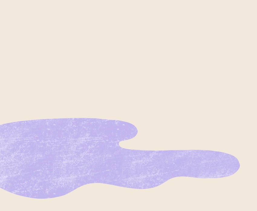
Limiting the illustration by colors was something we wanted to experiment with. It was important to stay true to the style guide, but Leaf Green was the one exception I made to the palette. I wanted to reflect the lush, exotic imagery of their lounge space and I knew it would work with their existing web images. Since Budberry's original brand colors are striking to represent innovation, the dark tones of the green helped us complement the Cod Gray while also recalling their plant-based product.

mocking up the wireframes
Next, I drew color sketches that could fit as placeholders in the existing wireframes. This way I could visualize the atmosphere of each page and communicate this vision to our stakeholders. Our designs were very collaborative and as the illustrations developed, the wireframes also developed to better incorporate them. Below is our first iteration of the designs with the UI elements mocked in.

homepage
S2. dispensary
Engage the viewer's attention here.
S3. & S4.
foliage & frame
Smooth aesthetic transitions from section to section.
S5. delivery
We're eco-friendly, fun and casual.

about
S1. about us
It's about the edibles.
S2. & S3. foliage
Smooth aesthetic transitions from section to section.
S4. our space
What sets us apart.
DELIVERABLES
refining the taste and texture
With our stakeholders' approval on the mocks, I refined the set of illustrations through color, line, and shadow. Inspired by the illustrative styles from our mood board, we want to add texture as well, so I experimented with different resources. In my sketches, I used a dark, placeholder pencil texture but eventually settled with a dusty brush texture in the same Linen color as the background. The choice was both a practical one and a conscious decision for a subtler undertone. I created the final texture myself after an exhaustive search of online resources.


the evolution of our
hi-fi wireframes
The impact my illustrations made inspired us to revisit the wireframes and see where we could reiterate the fluid lines and dynamic breaks between sections. Looking at a holistic view of the UI helps us craft a strong narrative for our customers' experience.

MOTION DESIGN
wiggle
To keep all three animated illustrations cohesive, each one had leaves blooming once visible, and then repeat a wiggle motion. The rustling of the leaves were designed to be random and minimal, keeping the page alive and interesting without distracting too much from the content. All the animations are triggered by the system when it appears on the viewer's screen, and will loop after 15 seconds.
dispensary
For the first animation that viewers would see when scrolling down the page, I wanted to quickly capture their attention and think, 'This isn't any ordinary website'. The storefront flips open to face the customer walking up to the shop, generating a friendly and welcoming emotion.
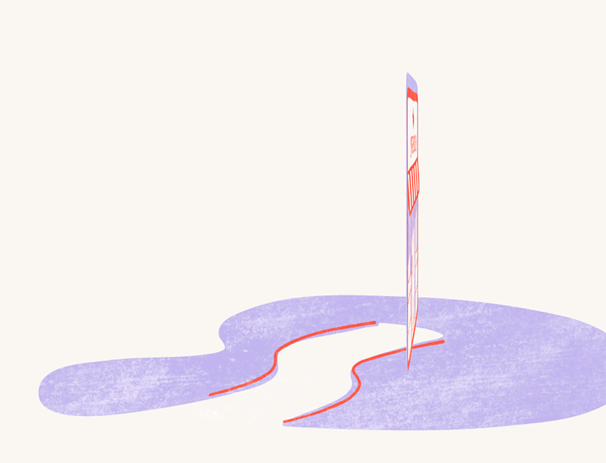
delivery
Although Budberry doesn't deliver by bike, we decided it was an eco-friendly and interesting symbol to use. It was also feasible to imagine a cyclist riding in from off-screen, directing viewers' attention to the text block on the right. Using movement (not just motion) to create focus is important when maintaining visual interest.
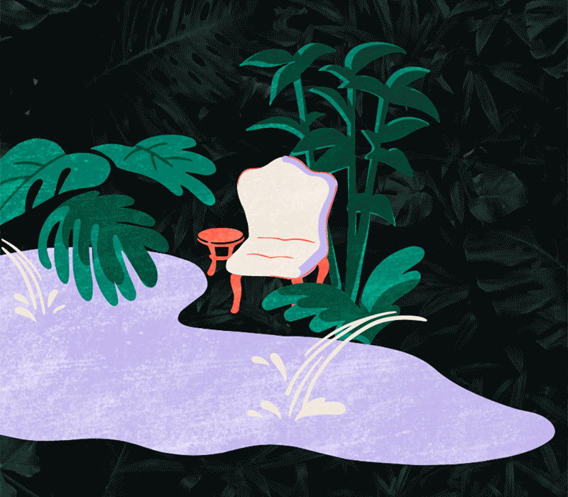
about us
Referencing the visuals from Budberry's lounge, I wanted to make their koi pond come alive because how often do you come across one of those in LA? Water and animals are notoriously difficult to animate, and with the constraints of code in mind, I kept it simple. Using fluid lines and details, the illustration pulled off the illusion of surfacing fish.
LEARNINGS
reflections
I had a blast creating these elements during my time at Hawke Media! It was awesome to be able to flex my illustration skills again while also applying it in the context of web design. The build phase was an especially unique learning experience because our dev had limited bandwidth that week, so we did it ourselves! Taking an opportunity to try something new is always stimulating, and I felt a great sense of accomplishment watching my animations come alive on the site. Unfortunately, Budberry seems to have closed since last year as their website and social media are no longer around :(
Regardless, I think the most impactful lesson I learned from this experience is how to be a good collaborator. Our team (a web designer and senior brand designer) really encouraged me to take ownership over the UI, and respected the contributions I made as a growing designer. I’m still learning, but I hope to be able to mentor other designers in the same way one day.